

The Impact of Colour in Luxury Interiors: Design Techniques for Creating Stunning Spaces
- Susan Van Meter
- Apr 18
- 3 min read
Colour shapes the atmosphere of a room and defines the experience of luxury within a space. At the Susan Van Meter Design Studio, colour is not just decoration; it is a powerful tool that influences mood, highlights architectural features, and elevates the overall aesthetic. Understanding how to use colour effectively can transform a home into a sophisticated sanctuary that reflects personal style and refined taste.
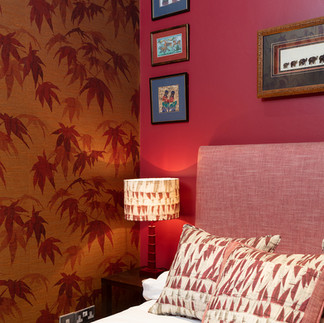
We created this intimate bedroom in Bloomsbury to highlight the client's personality through character with colour, pattern, and texture, and to display their collection of African art.
Deep Reds For Mood & Itamacy


How We Use Colour To Define Our Luxury Interiors
Luxury interiors rely on colour to create a sense of exclusivity and comfort. Colour can:
Set the mood: Warm tones like deep reds and golds create intimacy, while cool blues and greys bring calm and sophistication.
Highlight architectural details: Contrasting colours draw attention to mouldings, ceilings, or built-in features.
Create depth and dimension: Layering colours and textures prevents spaces from feeling flat or sterile.
Express personality: Bold colour choices can signal confidence and creativity, while muted tones suggest timeless refinement.
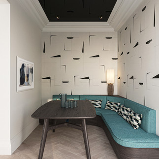
Back To Black For Impact


How We Use Colour Drenching and Its Effects
Colour drenching means covering an entire room or large surface area with a single colour or closely related shades. This technique creates a dramatic, immersive environment that feels cohesive and intentional.
Creates impact: A fully saturated room feels bold and curated.
Enhances mood: Surrounding oneself with one colour intensifies its emotional effect.
Unifies design elements: Furniture, art, and accessories blend seamlessly when anchored by a dominant colour.
Invites texture play: When colour is constant, texture becomes the main source of visual interest.
Each room has a unique function and energy, so colour choices should reflect that while maintaining a cohesive flow throughout the home.
Blush Pinks for the Girls


How We Use Texture to Enhance Colour
Texture plays a crucial role in our luxury interiors. Smooth, glossy surfaces reflect light differently than matte or rough textures, affecting the colour’s intensity and warmth.
Velvet and silk fabrics deepen colour saturation and add softness.
Wood and stone introduce natural variations that complement neutral palettes.
Metallic finishes like gold, bronze, or silver add sparkle and contrast.
Textured wallpapers or wall panels create visual interest without changing colour.
Go Bold, Go Black & White


How We Use Colour in Home Design
We approach colour as a strategic element to enhance both aesthetics and function. This process includes:
Assessing natural light: Understanding how sunlight affects colour throughout the day.
Considering room purpose: Choosing colours that support the intended mood and activity.
Creating a palette: Selecting a harmonious set of colours that flow between rooms.
Testing samples: Applying paint swatches and fabric samples to see real-world effects.
Balancing boldness and subtlety: Mixing statement colours with neutrals for lasting appeal.
Incorporating client preferences: Reflecting personality while guiding choices toward timeless luxury.
Using colour to highlight architecture: Painting mouldings, ceilings, or niches to add dimension.
Layering textures and finishes: Combining matte, glossy, and tactile surfaces to enrich colour perception.
Colour transforms luxury interiors by setting the mood, defining style, and enhancing architectural beauty. To understand The Impact of Colour in Luxury Interiors, contact Susan below for a free consultation.
We look forward to hearing from you.
The Susan Van Meter Team - Going Beyond Design in 2026


Comments